STAY IN TOUCH
Subscribe to our newsletter for studio updates and design inspiration.

Subscribe to our newsletter for studio updates and design inspiration.
An award winning design firm with offices in New York and Minneapolis, working on full-service, custom residential, commercial and hospitality projects worldwide.
During summer, we’re naturally drawn to certain colors as the palette of nature shifts. Greens and blues are out in full force, from the lush grasses to the sky and shimmering lake waters, and everywhere we look we see splashes of yellows, purples, reds, and more. Yet, these colors aren’t only for this warm season, and especially when it comes to green, there’s no limit to the ways it can be incorporated into your home’s style for a year-round look that continues to impress.
So, in today’s post, we’re talking all about the color green and how you can use a variety of shades to complement your home. After all, it’s a color that runs the gamut from understated and sophisticated to bold and unafraid, so there’s a shade (or a few) that are sure to fit right into your design aesthetic.
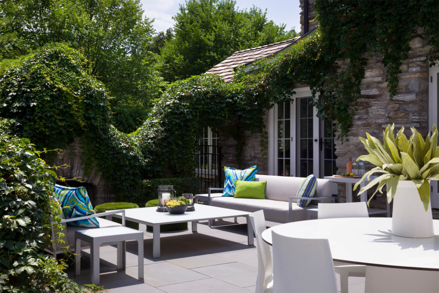
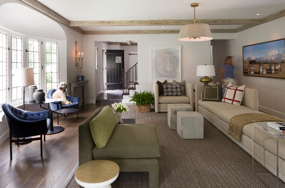
First up in our rundown are the light and soft shades of the green spectrum. These include everything from subtle light pastels to unobtrusive muted tones. Opting for one of these shades is perfect if you’re looking to pull out a touch of color within the space without green taking center stage. It blends seamlessly with its surroundings, adding a touch of interest without going overboard. Plus, they allow for versatility if you already have a bold green at the heart of your design – simply layer a few of these lighter hues around the room as well and you’ll have a curated patchwork vibe that’s absolutely gorgeous.

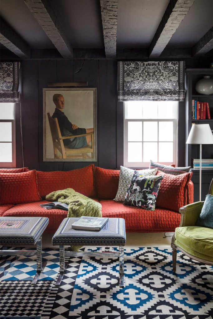
On the other end of the green hues lie those deep and moody shades we typically associate with fall or winter (but are absolutely stunning in spring and summer, too). Think evergreens, mosses, and jewel tones – these colors are known for their deep and moody aesthetics and can add a richness to the space that helps to bring about depth and interest. If you’re drawn to this group of hues, they’re ideal for anchoring the space either in the room’s wall color or in a stunning piece of furniture. Use the deeper tones to create a base for your design, then brighten up complementing elements for an eclectic and all-around layered look.

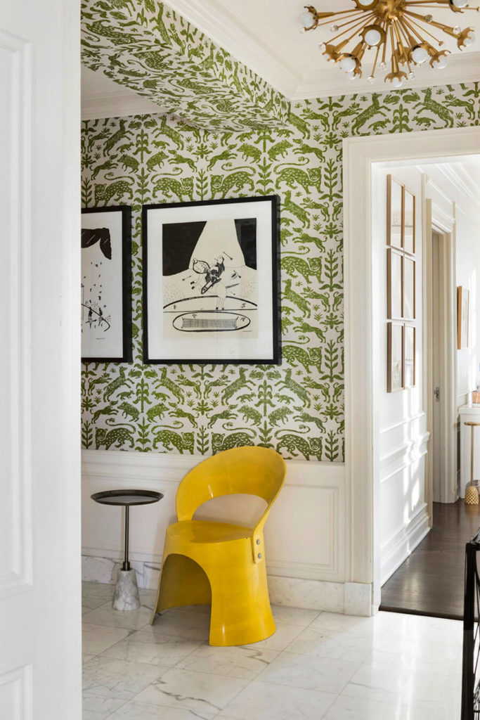
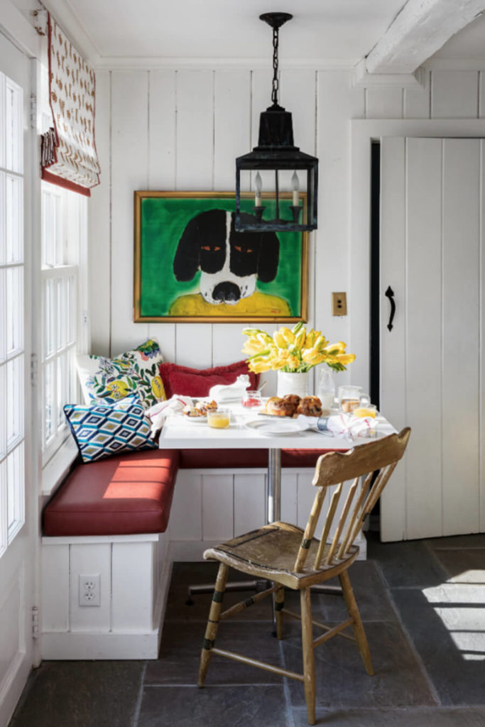
Finally, we have those bold and saturated hues that are often hallmarks of these hot summer months. The vibrant greens of freshly-cut lawns and trees in full leafed glory bring to mind the unmistakable green of the primary color wheel that is always fresh and strong in terms of our personal associations. Because of these shades’ saturated hues, it’s important to use them purposefully and sparingly. You want their elements to pop as accents within a space versus taking over the entire room. Add splashes via artwork or upholstered chairs and be sure to balance the rest of the room with a healthy amount of neutrals and a streamlined color palette.


This summer, we’re all about embracing green in our design work, and whether you’re inclined towards darker and moodier hues, or prefer light and airy touches here and there, there’s no doubt that this color is a win for this season and beyond. It’s the perfect transition shade and we guarantee it’ll make your space feel energized and new, no matter your personal style.


